Don’t Forget About Mobile – Websites That Aren’t Easy to Peruse on the Move Fall Short
With limited attention spans, and even less time to spend on fruitless searches, there simply aren’t many second chances to engage and capture an audience. If a potential client or customer website experience falls short…it’s onto the next domain, which very well could be a competitor.
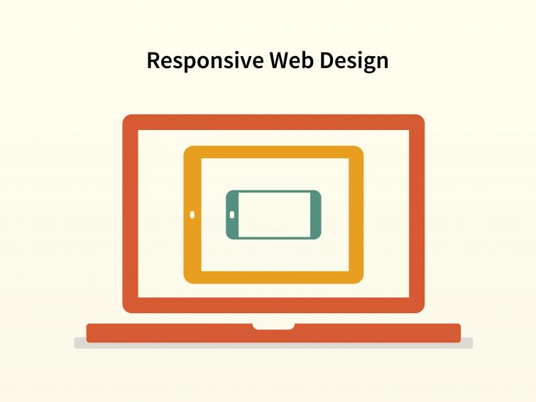
To ensure your website looks its best—no matter where it’s being accessed—an approach called “responsive design” can be the answer. In short, this technology allows websites to automatically adjust to fit the parameters of the screen on which it’s being viewed. So whether you’re on a phone, tablet, or phablet, the navigation and layout of a site is always easy to view and digest.
While it’s important to understand your specific audiences and determine if mobile usage is a need for them, based on the general population’s tendencies, responsive design is a key design element to consider for a majority of companies. This is definitely worth exploring the next time a new website is being developed.
The HCK2 team has experts that know the responsive design process forward and back. We’d be happy to explain it in depth and breakdown how it can help you capture more attention to strengthen your brand and grow sales.